Light matters in photography. Simply put, photography is light. Okay, maybe that's a little uppity sounding, but it's at least a recording of light. Light bouncing off of an object and entering the lens to be recorded in a chemical reaction on film or as a shit-ton of ones and zeros on a memory card. Right, right. You get that. I know. But good photography is about more than just the presence of light, it's also about the quality of light. Light has shape and direction and color. And with out boring the life out of you let me just say that they make a difference. A big difference. So at a certain point good photography is less about cameras and lenses and tripods, and more about learning to control light; making it do what you want.
Recently, my Dad asked me to shoot a photo of coatrack and bench that he built for us. So, first I cleaned up all the shoes and hat and gloves and other crap that's usually in our front hall, and then set about lighting it. I've been meaning to write about this process for a while, but I never seem to save the test shots that I take while setting up a shoot. Why? Because they're bad. And they should be, I use them to see what needs to change and then delete them. But this time I keep my grubby little fingers off the trash button so I could show you lovely people how I build a lighting setup.
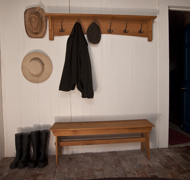
So first is a shot of the room with no extra lighting, just an exposure with the ambient light in the room.
Blah. Flat boring light, very two dimensional and it's a little hard to tell what we're looking at. There's no definition in the coat on the rack or the boots on the floor, and the doorway into the other room is completely blacked out.
So next I add a light in the room for "fill." This brings the overall light level in the room up and fills in some of those shadows. Still not great, but better. Right?
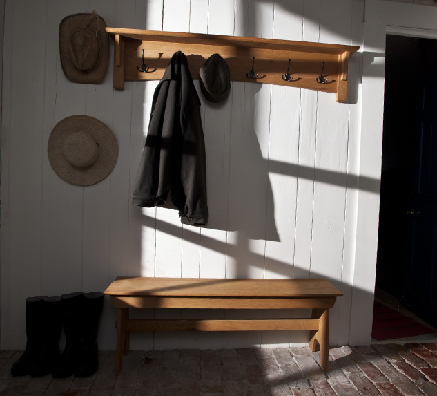
Next I add a "key" or main light. This light, positioned outside the window in the front door, gives shape and depth and raises the light level in portions of the image. It also gives the cool shadows on the wall imitating real sunlight streaming into the room.
This light gives the photo interest. This photo was a test with out the fill light to see how bright the highlights would be on the wall and how dark the shadows are with out the fill. Kind of an interesting photo, but a little sinister. More importantly we can't see the the coat rack and bench very clearly and they after all are what we're photographing. If this was an art project I might prefer this one and work with it a little more to get the exact look I wanted, but this, people, is product photography. So we add the fill light back in, make a few little adjustments to the angles of the lights and BAM. Done-zo. Dad gets a photo to show off his hand work and no one assumes that I live in a cave. Thanks, additive lighting process!
**Okay, full disclosure the final image is also adjusted for lens distortion (notice how the bench and coat rack are alined with the top and bottom of the frame unlike the other images where one or the other is really crooked, sneaky huh?), which makes a difference in the final image, but I wasn't going to bother doing that with the test shots. They're just frickin' test shots, people. Either way you see what a difference the right kind of lighting can make. Pretty cool.


